Responsive Design in Emails
What to Take Into Account When Making Responsive Designs
Today it is common to access emails or websites from mobile devices. This behavior presents a challenge when planning communications and designs to look good in different scenarios without doubling/tripling the work to be created. Applying responsive design solves this challenge.
What Do We Call Responsive Design?
Responsive design is the adaptability of a design to be displayed when viewed at different sizes, whether on large monitors or mobile devices. This adaptation is originated through automatic adjustments to the design following standard guidelines.
With Prisma, you can get responsive designs without doing anything extra. Communications made for emails, pages, or others, will be automatically adjusted to different devices where they are displayed. For this to happen, some components of the design behave differently depending on the situation.
The elements that will change to adjust the design are:
- Columns (adaptation to rows)
- Images (adaptation of sizes)
- Email body (adaptation to the width of the screen)
Adapting Columns to Rows
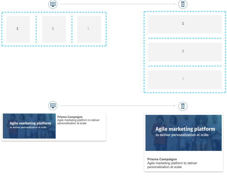
It is common to make email or page designs using columns since they allow to organize a lot of information in an orderly way, be it photos or content.
Columns are used for large devices (desktop, tablets), but not so much for smaller devices since columns won’t fit or display information accordingly. Therefore, a standard practice in responsive design is transforming columns into rows on small screens. Below is a visual representation of how it works:
How to Keep Columns on Mobile Devices
In those cases where the mentioned behavior (columns to rows) is not desired, Prisma allows overwriting this behavior by explicitly keeping the columns in small screens. This action is achieved by changing the Responsive attribute from the column you want to maintain on smaller devices to FIXED option (as shown in the image below).
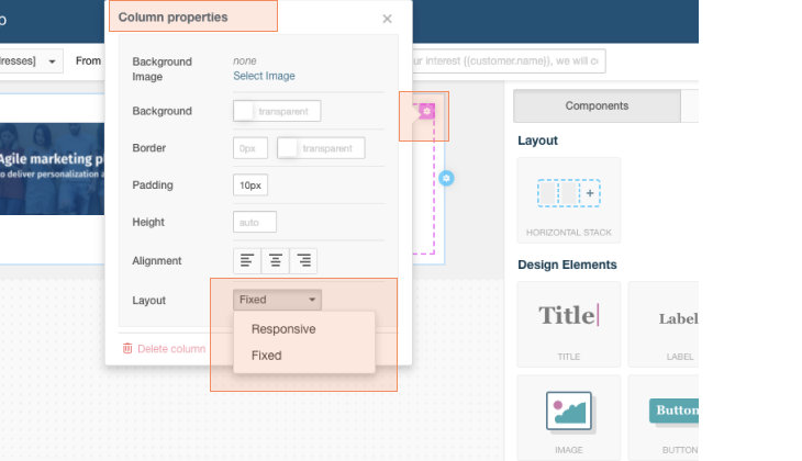

Image Behavior
Images are an important part of communications and therefore play a role in the assembly of the arts.
It is important to first consider preparing the images for proper use. You can do this by visiting the article Images recommendations (size/format)
For the designs to adapt, images need to fit and they do so by changing some of their properties to adapt to the space they have.
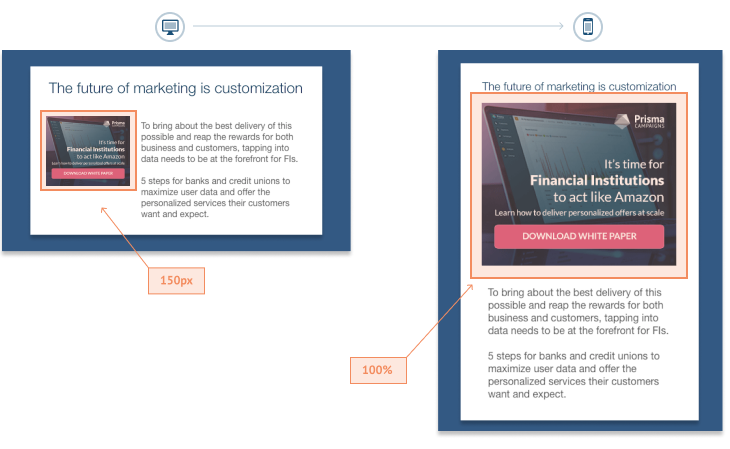
As we see below, if we have 2 columns and an image with a measurement (for example 150px), on large screens the image will be displayed with the indicated measurement. However, on mobile devices, as there are no columns, the image will have more space to display, so it will adapt to the entire width of the screen, as can be seen below:
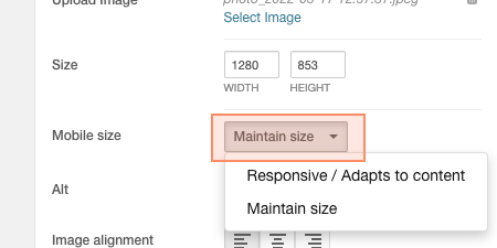
In those cases where the mentioned behavior (image size adaptation on mobile devices) is not desired, Prisma allows overwriting this behavior by explicitly keeping the image size in small screens. This action is achieved by changing the Responsive attribute from the Image Mobile size property to Maintain size option (as shown in the image below) to maintain the defined size of the images on small screens..
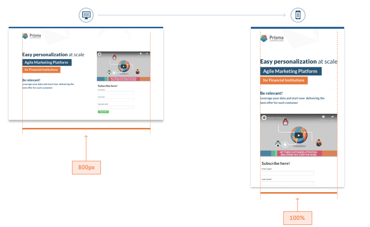
Mail Body Width (Body)
It is common to see that email templates use width measurements, with the standard being between 600px and 800px. This allows the content to be centered on large screens and makes it easier to read and view. However, when the same layout is displayed on mobile devices (which are around 320px wide), the email body size is no longer relevant.
This is why when a fixed-width design is viewed on mobile devices, the pixel measurement is converted to 100% so that the design can be viewed in full width without scrolling.
Related Articles
On this page